skip to main |
skip to sidebar
Literally! I've had a cold for the past few days and I'm pretty tired.
I haven't scrapped much but my husband asked me to scrap him something for his office.
The requirements were that it was a picture of myself and our son together, on which my son had to be smiling. The scrap had to fit in a frame, the picture of us had to be big (so we could see our faces) and he didn't want it to be too "girlie".
Finding a picture of me and Cédric where he smiles and I look okay was challenging, so I had to merge two pictures (his face in the picture is actually from another pic.). And to keep our faces big enough I had to scrap in 72ppi.
I used the beautiful collab Down by the Lily Pond, by Vicki and Mel H. And here's the result!
 Dave: I hope you like it...love you!
I really had quite a few landscape pictures!
So here's one more. It's a rainbow that we saw right from our house in Ottawa. If you look closely on the right, you can see the secondary rainbow and the darker ski in between. One of the best rainbows I've ever seen.
I had a really hard time with this one. I kept the same kits as for the previous stormy landscape (it's actually really hard to find colours that complement those pictures...). So I used Linda's Chance of Rain and Shel Belle's Celebrate Love alpha:
 PS: don't forget to go get the elements for Mon Amie on Stacey's and Vicki's blogs.
I'm really excited because I won the Scrap N'Art Jan/Feb monthly cause challenge! The layouts were the Proud of You layout (about blood donation) and the Heroes layout (about random acts of kindness) which can be seen in my gallery. I'm not sure which of the two won (or if it was for both).
As a thank you to everyone else, I made a wordart with my Heart of Stone alphas, and you can have it as a freebie! I made an English and a French version, both are personal use only. Here are the previews:

 I used the font Pea Stacy's Doodle Script from Fonts for Peas and my alphas.And here's the link to 4shared to download them (both are in the same file):
http://www.4shared.com/file/88511805/1a98adf6/poppylium_heartofstone_wordart.html?dirPwdVerified=1808526a
If you download, please leave me a comment (here or on 4 shared).
Yesterday was Family day here, so we got to keep Hubby/Daddy home an extra day. We had a really good, quiet day at home.
And of course, I scrapped!
I made one more layout for that nature series I started.
It's a picture I took in the Massif Central (volcanoes in the middle of France), from a moving car! When there's going to be a storm, the dark clouds make the greens of trees brighter and I just love it.
I used Linda's Chance of Rain kit and Shel Belle's Celebrate Love alpha.
The text is a French expression that literally means "there's a storm in the air" (and also figuratively means there's tension, anger between people or a fight about to happen).

PS: My designing experiment is more of a turtle than a hare as I have to date 12 downloads on 4shared. Compared to other designers, it's not much, but to me it's amazing!
Today, I did a last minute layout for another challenge from the Scrap Pad. The rules were to scrap about a Random Act of Kindness:
 I used Vicki's Blue Earth kit and the Hoefler text Ultra light-italic font.
I did it once first and it was the ugliest thing ever, so I started over...what do you think?
I know it's a little late in the day, but I made it just in time to wish everybody a happy Valentine's Day.
And for the occasion, I decided to share the love and offer you my first ever creation as a freebie.
The last few days, I made a couple of coordinated alphas! I also made a paper and an element to go with them. I can't really call it a kit, but it's two alphas and a couple of extras.
Here's the preview (click it to go to 4shared and download):
 http://www.4shared.com/get/87694030/38bee2b6/poppylium_heart_of_stone.html
I hope you can find a use for it!
I would also love any constructive criticism or advise and, if you use it, I would love to see your pages (leave me a link to your creations or send me an e-mail).
Marif XO
PS: I included all sorts of things that may seem strange to English speakers, but the French among us should appreciate...
After making the sun king layout yesterday, I realized I had a problem: not enough fonts to choose from...Ok, I do have quite a bit, but they are the usual, unoriginal ones, so I've decided I'm going to slow down the downloading of kits (except of course for any Vicki, Sara, or Stacey freebie) and I'm going to start looking for fun original fonts. I started with Fonts for Peas. Awesome webiste!
Here's another layout with pictures I took recently of the sunrise (through the kitchen window). I loved the low clouds and the way the sun peaked through.
I had the hardest time choosing colours to match the pictures but ended up picking Stacey's A Little Sassy.

The weather is a bit nicer and getting warmer these past few days, allowing us to take Cédric out a bit more among other things. It not only gives me energy but it inspired me to change the focus of my scraps a bit and use the few pictures of nature and landscapes that I took over the years.
The first one is of the view we had from our house in Kingston, ON. We only lived there for 8 months and it's the thing I miss the most about living there: that view every morning from our breakfast table (it was East too...). We saw so many beautiful colours on the trees as well as birds, deer, ... it was amazing.
I scrapped it with Vicki's Rustic Walk.

After I finalized the challenge layout this morning, I had a nice normal digiscrap-free day. I
cleaned up the house, had my brother-in-law, his wife and their son over for pizza and a movie and just put my son to bed.
Now I have to try to figure out what I can and want to do to give back a little. I've been downloading so much since I started that my computer will explode. I owe everything to all the generous and talented designers out there without whom I couldn't digiscrap at all.
When I started this hobby, I made a promise to my husband that I wouldn't spend money doing it at all. He works hard for me to be able to stay at home with Cédric and I have to keep that promise, so to all the designers out there a huge THANK YOU.
Now I'm just trying to figure out how I can give something back, still without spending... If anyone has an idea, let me know!
PS: do you like my new slideshow? That way you don't have to go to my gallery to see my scraps. You gotta love blogspot!
I love challenges! I just finished a layout for Stacey's Scraptunes challenge over at Scrap N'Art. Somehow, it was the hardest layout ever for me, I changed it a lot, even at the last minute, but I enjoyed every minute of the frustration. The rules were to scrap an inanimate object and include song lyrics. I chose the ring that I just got for my 30th birthday which was originally my great-grandmother's and was passed down to my grandmother, then my Mom. It was bought in the late 20s in Paris and I can't beleive it's mine now. It's gorgeous and very meaningful.
For the song, what better choice than "Diamonds are a Girl's Best Friend". I took the inspiration for the colours and style of the layout from the actual scene in the movie (http://www.youtube.com/watch?v=p0FDGnAIWpk) and here's the result!
 Feedback is always welcome...
PS: If anyone was wondering, I didn't make the CT I applied for...better luck next time.
This morning, I was happy to find the last part of Stacey's kit "Sk8 or Die Dude", the alpha, and I got straight to work when Cédric went down for his nap. Here's the result:

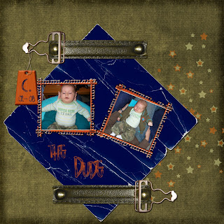
It's done with a picture of Cédric at 2 months old, in a onesie my Mom embroidered for him. I thought his outfit was perfect with the kit (thanks, Stacey)!
It's -20 celsius outside, so chances are I'll scrap some more this afternoon...
I don't have much to say tonight. I chose not to scrap today, I had things to do that could be done in front of TV but not while srapping. So instead, I did laundry and squash puree for my son in front of the Sex and the City movie and although I watched it in 3 parts (during naps), it was FABULOUS!
Any other SATC fans?
So today is exciting for me blogwise!
First, I made a new layout that I'd like to show you. I did it with Stacey's kit Wild Flowers:
 Second, I applied to be part of her CT. I know she'll have a lot of talented applicants, but I figured I'd give it a shot.
Third, I got my first "real" follower. My other follower was my very sweet husband... he's pretending to be insulted about not really counting as a follower, but he's far from an avid digiscrapper!
Let me know what you think about the layout,
Marif
So, I figured I should explain my blog's weird name...
First of all, all the good ones are taken, it's hard to come up with something.
I knew I wanted to use the painting I made in my header (the three central flowers). I painted them instead of having them tattooed on my lower back (my husband wasn't fond of the idea). And then I thought that I could use them for the name as they represent who I am. They are a western red lily (the flower of Saskatchewan which is where I was born), a poppy (to represent France which is where my whole family lives, where I grew up and where I'm really from) and a trillium (the flower of Ontario which is where I now live). So I amalgamated the three words poppy-lily-trillium in many possible ways and ended up liking Poppylium!
What do you think?
 Dave: I hope you like it...love you!


